Design, Photo & Fashion

How to Design Architecture

Authored by Frank Gehry

Architect

As Shakespeare said, “All the world’s a stage,” and the buildings you design are the stages on which life is acted. These steps will help ensure you design places that are spaces where people will want to work, play, and live.

Part 1 of 11

Embrace the uncertainty

Architecture, like all creative fields, begins with the unknown. Be curious about it, and accept that you don’t know what you’re going to do in advance. Don’t overthink it—just follow your initial idea and see where it takes you. Architecture is like jazz: You respond and work intuitively to create something. If you know in advance what you’re going to make, then you won’t do it.

Part 2 of 11

Think of the building’s purpose

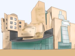
If you’re designing the Walt Disney Concert Hall, consider that its purpose is for people to experience music. Design a building that people would like to be in while experiencing music, where they can enjoy the company of others, and where the audience and musicians can sense one another.

Part 3 of 11

Respect your architectural neighbors

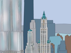
Your buildings shouldn’t be identical reproductions of their neighbors, but they should respect their existence. For example, if you’re building a tower in New York City next to the Woolworth Building, respect its seniority. Show homage to its beautiful structural cap by not putting a cap on your own tower.

Part 4 of 11

Start by drawing on paper

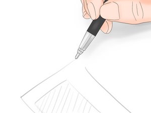
Even a quick sketch on a piece of paper requires human touch and hand-eye coordination, whereas computer images are just geometry and drawings. Their humanity is entirely eliminated.

Did you know?

Buildings are becoming less inviting and more faceless, but putting trees all over them helps retain their humanity.

Part 5 of 11

Design something comfortable, not pristine

Think about and consciously implement what makes someone comfortable. Our world is a collision of thoughts that surround us, and it’s represented through our art, music, and buildings. A neat, clean box seems like a lie, whereas messiness is a signature of the times. Houses are meant to be lived in, so it’s logical that we would express that in what we build—that it’s comfortable and a bit messy.

Did you know?

A pristine house, like Mies van der Rohe’s Farnsworth House, can be a beautiful example of architecture, but its design overpowers daily life and feels more like a museum than a house.

Part 6 of 11

Explore your crazy ideas

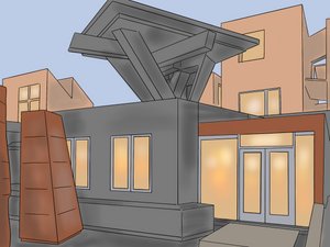
If you have the urge to design a house with a suspended brick facade, don’t shut down the idea as stupid just because bricks are heavy. Explore the idea. You can create the logic for it as you go along, and it’s an opportunity for you to design something with a familiar material that no one has done before.

Part 7 of 11

Expression is more important than symmetry

If your composition is symmetrical, you’ll be forced to balance where the windows go, where lighting goes, etc. An asymmetrical design, however, is freer and more casual, so your buildings won’t feel like an imposition.

Part 8 of 11

Repeating yourself is a strength, not a weakness

It can feel strangely dishonest to take something you’ve already done and use it again. Our culture says everything has to be new and different, but you can find inspiration and beauty in looking at your old works.

Did you know?

Mies van der Rohe, one of the best architects of the last century, did the same building over and over again, and when you look at his Lake Shore Towers or his black steel buildings, you’ll recognize their power.

Part 9 of 11

Do your best, no matter how small the project

Even if you are designing field latrines for army maneuvers in the swamps of Louisiana, make sure it’s the best you can possibly do for that job. You never know if your building will be a success or not, but you can always do your best.

Part 10 of 11

Look at your design until you hate it

You will have epiphanies and eureka moments, and you’ll want to test them and see where they go. Designing buildings takes a considerable amount of time, and some days you’ll hate what you’re looking at. That’s a positive thing, as it can inspire the next step.

Part 11 of 11

Respect your deadline

Having a due date is healthy; it requires you to self-edit and recognize when you’re done. Otherwise, you could go on designing forever, and going past that date causes difficulty for your clients and team.

Did you know?

If the design isn’t turning out the way you want, it’s acceptable to ask the client for a bit more time.

masterWiki is
MSCHF Drop #27
masterWiki
is MSCHF Drop #27